The new British pro team hits the road next year and we want you, Cycling Weekly readers, to design the jersey you think they should wear.
It’s just for fun, but there’ll be a prize for the best design, and another for the one that makes us laugh the most. We'll also send the best ones on to team boss Dave Brailsford and ask him what he thinks.
So get creative, either with crayons and paper, or with a sophisticated computer programme, and send your design to cycling@ipcmedia.com, attached to the email as a .jpg file.
We’ve included a Sky logo to drag onto your desktop to include on the jersey.
There are no rules except keep it clean. Remember, Alexandre Vinokourov’s interpretation of tasteful jersey design was to include a big picture of his own face, so let your imagination run wild. We’ll publish the designs on this page as they come in…
Thank you for all your entries. The competition is now closed.
Get The Leadout Newsletter
The latest race content, interviews, features, reviews and expert buying guides, direct to your inbox!
The jersey the Sky+HD track team wore last winter, featuring Sky's corporate colours
The Sky logo, this must be included somewhere in your design (colour optional)
Entry number 1
Entry number one comes from Matthew Betts of London. He says; "The team is called Sky, so the sky blue colour seemed obvious. My dad has a Campagnolo jersey with a white stripe across the chest which I really like, so I basically copied this. The stripes around the edges of the shirt are meant to give it a bit of a modern feel and mimic the Sky+ HD shirt."
"I feel the smaller logos look classier and more refined than big ones plastered across many of the shirts. Finally I'm fed up of watching TV coverage and not being able to identify the riders – I have no idea why teams don't do this but I'd really like Sky to be the first pro team to put the riders names of the back of their shirts."
Entry number 2
Jacob Lage has sent this image through of what he thinks the Team Sky jersey should look like. We'll have more details on it soon.
Entry number 3
Entry number three is from Anthony Derrick. He says; "I chose the red colour because it would stand out, and white because it is clean and goes well with the kit."
Entry number 4
This design comes from Peter O'Hanlon who says; "On the black there are stars set against the night 'Sky' with a setting sun against a blue 'Sky'. The sky logo is also shaded from blue to black. The black and blue skies represent the Sky company, its services, corporate image and coverage."
"The stars could be used to attract individual sponsors who can have their name or company logo set within the star - just keep adding new stars as you gain more sponsors. You could increase the sales of the shirts by selling them to individuals who could have their names set in one of the stars. The shorts are a patriotic red, white and blue."
Entry number 5
By Kevin Dakin who says; "Sometimes, simple is best. A mate of mine once said to me of jersey design, 'can you see it from the helicopter?' I would have stuck the logos 'SIS' on the sleeves and the 'skynews.com' in smaller areas on cuff edges or side panels. Logos attached are simply one's that BC have a relationship with, some speculative, but easily removed."
Entry number 6
This one from Scott Gasser. "To celebrate the fact we finally have a British Pro Team, I decided to incorporate a red white and blue colour scheme. The jersey is predominately white representing a clean image for a clean team. This white is also great for keeping the riders cool and the ideal canvas to highlight Sky's 'Believe in better' tag line. 'Believe in better' is also a great tag line for the pro cycling team, to always strive for better in all they do, to achieve results. I also de
cided to add a little fun to the jersey, by popping a Sky+HD remote control in the back pocket to compliment the Sky+HD branding down the side of the jersey."
Entry number 7
This one from Luke Pickering. "Stars like you get in the sky. Sleeve design ripped off
from your new website. Union Jack on the collar as it's a British setup. I wanted to put the "Believe in Better" strapline in there but I didn't have time."
Entry number 8
Robotic entry number eight comes from Murry Toms. He says; "There’s no real thought process which has gone into my design, only that through my association with a local charity, namely Cyclists Fighting Cancer (www.cyclistsfightingcancer.org.uk), I have seen some pretty superhuman efforts by cyclists, and all in a good cause. I have nothing but admiration and respect for the cycling fraternity, whether a local biker is making the trip from Lands End to John O’Groats to make a small difference to someone else’s life, or if it’s a member of the elite powering up Mont Ventoux. With a bit of luck my design reflects this."
Entry number 9
William and Rasmus from Denmark have come up with a very strong jersey: "We wanted to hit the design of the very well-made Sky HD+ jersey, but still get something a little more classic jersey design out of it. This jersey is far from simple, but we do like some a little more complicated jerseys e.g. the Astana jersey or the Katusha one. We've implanted some Adidas stripes as well as there is in the Sky HD+ jersey, but not too much though - just on the shoulders. As Sky as the big sponsor of the team, we implanted basically Sky logos at every availabe spot of the jersey, so Sky can get the best out of their fantastic investment. Please also notice the detail of the mix between the slogan of Sky, Believe in Better and the british cycling association: Believe in Better British Cycling."
Entry number 10
Chris Silbernagel hails from Chicago, Illinois, and submitted this clean-looking design with subtle Sky logos in the background.
Entry number 11
Dave Simms from Weymouth has come up with this very eye(brow)-catching design featuring the face of Sky supremo Rupert Murdoch. "In between Twittering what I ate for breakfast and what I was about to cook for lunch, I came up with this design," says Simms. "I tried to catch the zeitgeist of Sky, using the juxtaposition of Murdoch's countenance and a simple yet hard-hitting message: Rupe 4 Ever. Without Murdoch, there would be no Sky, and therefore no cycling team. It's both anodyne and amorphous and several other words I read in the Guardian this morning." Thanks Dave. We think.
Entry number 12
James Durbin from San Diego has opted for a design incorporating a background texture picture based on photos of galaxies. "I've tried to keep it simple, but I would like to introduce a little red as a highlight for team logos and such," says James.
Entry number 13
The next jersey design comes from Charles Gillies, Glasgow. ""I tried to keep the design simple because I believe that simple jerseys are the most stylish and the most effective at giving the sponsor the exposure they want," says Charles.
"The jersey is white representing a clean image for a clean team. This white is also great for keeping the riders cool and makes the colours black, red and blue stand out. I chose the colours red and blue to highlight the nationality of the team, and I wanted to use the motto 'believe in better' as I thought it was quite appropriate for a cycling team striving to achieve their best!"
Entry number 14
Next is Tim Barnett, who sent in this colourful design. "This idea is based on the yellow from the sun's aura being the chase for the yellow jersey, the Sky logo always makes me marvel at space and planet earth," Tim says. "The red forms the subliminal red white and blue of UK. I've also added small Union Jacks to celebrate the first British team to go for the Tour de France since 1987."
Entry number 15
The latest entry comes from Tiago Cassiano
Entry number 16
An absolute cracker from Peter, we're thinking of getting him to design the next batch of Cycling Weekly kit. He says; "Well it all seems to be getting too serious so I thought this design may lighten the mood! Unlike football you there doesn't seem to be a shirt for the armchair cyclist, this could be it."
"It features a Sky dish and a free Sky box. The traditional rear pockets have moved to the front so that the sportsman, sorry or sports girl, can have their tinnies to hand! Plus lots of other features. Oh, you are going to ask me where the logo goes - I don't know, there isn't enough room."
Entry number 17
James Durbin (who also sent in number 12) has emailed in another, alternative design for the jersey.
Entry number 18
Eduardo Ataide from Brazil sent in this clean design. "This shirt design was inspired by British flag," says Eduardo. "I've chosen its colours and put them to work as the base. Graphics follow the shirt's sewing lines. The crosslines come in to give a different texture."
Entry number 19
Martin Street from Kent has sent us this design. "I wanted to recognise the essential British-ness of the team, whilst not alienating the inevitable non-Brit riders," says Martin. "There's a nod to the Union Flag in the colours and design and if Adidas make it, it'll fit in nicely with both the England cricket team's One Day kits and the GB Athletics team's garb."
Entry number 20
A third and final entry from James Durbin of San Diego features the British flag in his design.
Entry number 21
This entry from Christopher Bone, who says; "I wanted to give it not only an eye catching, but also a very patriotic design. The basis of this being the red, white and blue design of the jersey, with the union jack on the shoulders, making it extremely distinctive from the helicopter, therefore making it easier to see our sky team boys amongst the peleton."
"Naturally the biggest sponsor logo is the sky one, also in red and blue, outlined against the white of the jersey. There is also the key placement of british cycling on the rear of the jersey, at the bottom, in order to promote the important role of british cylcing in the cycling world. Cant wait to see the actual final design for the sky team jersey hitting the roads and most importantly winning stages around the world."
Let us know what you think of the designs and what you think the jersey should look like in the comments section below.
Thank you for reading 20 articles this month* Join now for unlimited access
Founded in 1891, Cycling Weekly and its team of expert journalists brings cyclists in-depth reviews, extensive coverage of both professional and domestic racing, as well as fitness advice and 'brew a cuppa and put your feet up' features. Cycling Weekly serves its audience across a range of platforms, from good old-fashioned print to online journalism, and video.


 Nightmares, niceties and gnarl: 10 years of the Transcontinental Race
 Why the best commute will always be aboard my old steel fixie

 Overachiever: Cameron Wurf competed in the Amstel Gold, La Flèche Wallonne and an Ironman, all in just eight days
 ‘I feel lucky to be alive’: Magnus Sheffield speaks for the first time about Gino Mäder’s fatal crash
 Tom Pidcock: Tour of Britain route 'not really ideal for me'
 This 39-year-old INEOS Grenadiers rider moonlights as a pro triathlete
 Ineos Grenadiers' only female rider Pauline Ferrand-Prévot eyes road return
 Egan Bernal has nose operation to help 'air passage' ahead of 2023
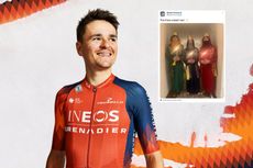 Tweets of the week: Ineos Grenadiers' three wise men, team jersey déjà vu and World Cup celebrations by bike
 Ineos Grenadiers sign their first female rider


